

上一篇:R语言学习笔记(1)——安装与示例演示
R语言预测包(forecast)[1] 的功能还是挺强大的。根据手册里的例子,运行了几段代码:
accuracy函数:计算预测准确度的一个函数
- Description
Returns range of summary measures of the forecast accuracy. If x is provided, the function measures test set forecast accuracy based on x-f. If x is not provided, the function only produces training set accuracy measures of the forecasts based on f["x"]-fitted(f). All measures are defined and discussed in Hyndman and Koehler (2006).
fit1 <- rwf(EuStockMarkets[1:200,1],h=100)
fit2 <- meanf(EuStockMarkets[1:200,1],h=100)
accuracy(fit1)
accuracy(fit2)
accuracy(fit1,EuStockMarkets[201:300,1])
accuracy(fit2,EuStockMarkets[201:300,1])
plot(fit1)
lines(EuStockMarkets[1:300,1])
R零基础的我,看这段代码有点困惑![]() , 是什么含义我也没研究明白,手册里也没有说
, 是什么含义我也没研究明白,手册里也没有说

再看看一段BATS model的例子:
fit <- baggedModel(WWWusage)
fcast <- forecast(fit)
plot(fcast)
这个模型的介绍是:Fits a BATS model applied to y, as described in De Livera, Hyndman & Snyder (2011). Parallel processing is used by default to speed up the computations.

在任何数据分析任务中,要做的第一件事是绘制数据。 图形使数据的许多特征可视化,包括模式,异常观察,随时间的变化以及变量之间的关系。
然后,必须尽可能将在数据图中看到的特征合并到要使用的预测方法中。
正如数据类型决定了要使用的预测方法一样,它也确定了哪些图表是合适的。
但在我们制作图表之前,我们需要在R中设置时间序列。
对于时间序列数据,显而易见的图表是时间图。也就是说,观察结果相对于观察时间绘制,连续观察结果用直线连接。
# 安塞特航空公司在澳大利亚两个最大城市之间的每周经济载客量
library(fpp2)
library(melsyd)
autoplot(melsyd[,"Economy.Class"]) +
  ggtitle("Economy class passengers: Melbourne-Sydney") +
  xlab("Year") +
  ylab("Thousands")
下图显示了安塞特航空公司在澳大利亚两个最大城市之间的每周经济载客量。

ggseasonplot(a10, year.labels=TRUE, year.labels.left=TRUE) +
  ylab("$ million") +
  ggtitle("Seasonal plot: antidiabetic drug sales")

library(ggplot2)
ggtsdisplay(USAccDeaths, plot.type="scatter", theme=theme_bw())
tsdisplay(diff(WWWusage))
ggtsdisplay(USAccDeaths, plot.type="scatter")

R语言的精简,语句比Python还少![]()
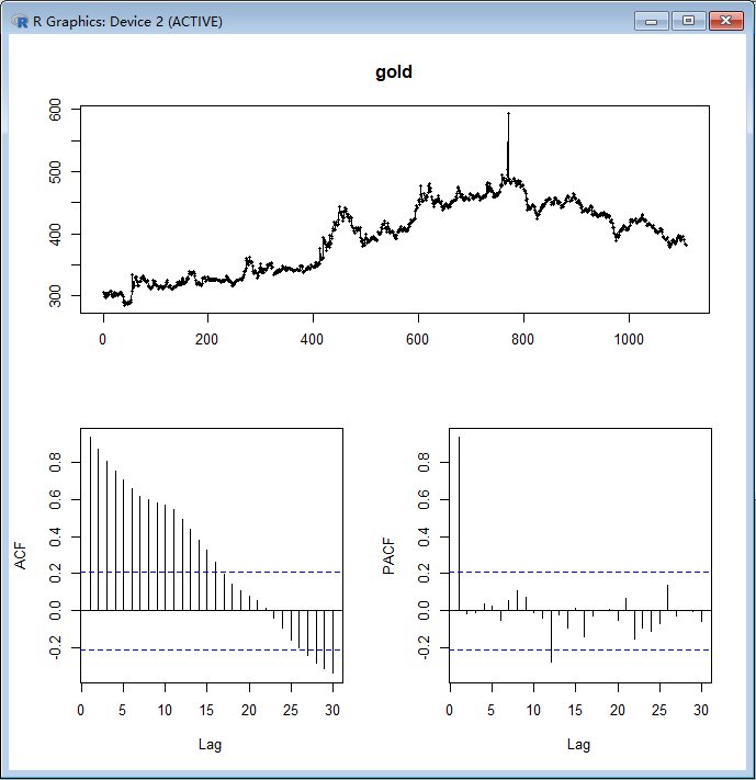
tsdisplay(gold)
Reference:
- Hyndman, R. J., & Khandakar, Y. (2008). Automatic time series forecasting: The forecast package for R. Journal of Statistical Software, 27(3), 1–22.
- https://otexts.com/fpp2/